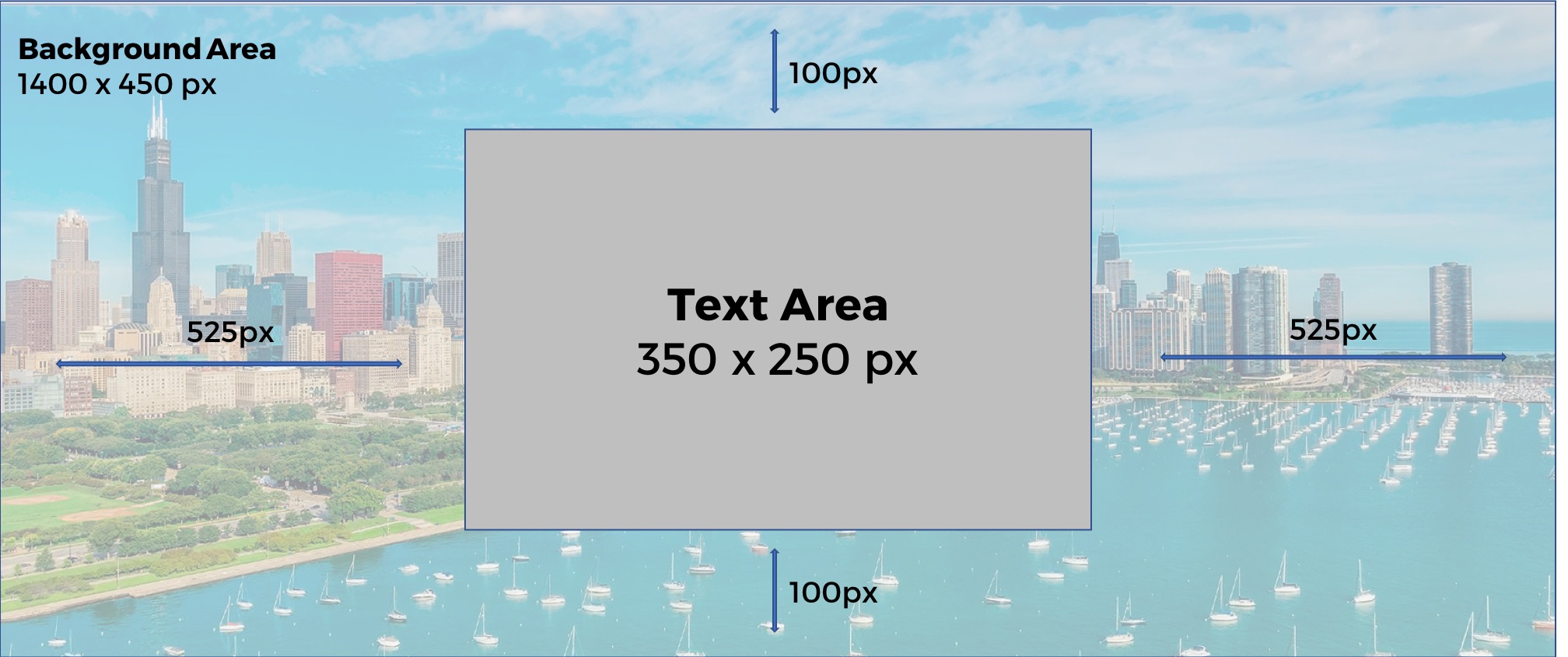
Hero Banner Image Specs
If you have a custom banner for your event and you notice that it looks distorted or cut off in one place (smartphone) and great in another (desktop) this can be fixed by adjusting the size of your i…

If you have a custom banner for your event and you notice that it looks distorted or cut off in one place (smartphone) and great in another (desktop) this can be fixed by adjusting the size of your image and the design to adhere to the following guidelines.
If you have text in your custom banner there is a safe zone right in the middle of 350 X 250 px. If you have a graphic designer on your team you might want to pass them this article, but if you are working on images in house follow the guidelines below. Keeping in mind, these are general guidelines based on commonly used devices for internet browsing. You may need to adjust your design so that it will be optimally viewed from any device.
Many websites adapt to different size devices for optimal browsing. While your Microsite is wider on desktop (to match your screen dimensions) you will start to notice a cushion of white space on the sides of your text boxes across all pages, when you look at the site from a smartphone that white cushion is gone.
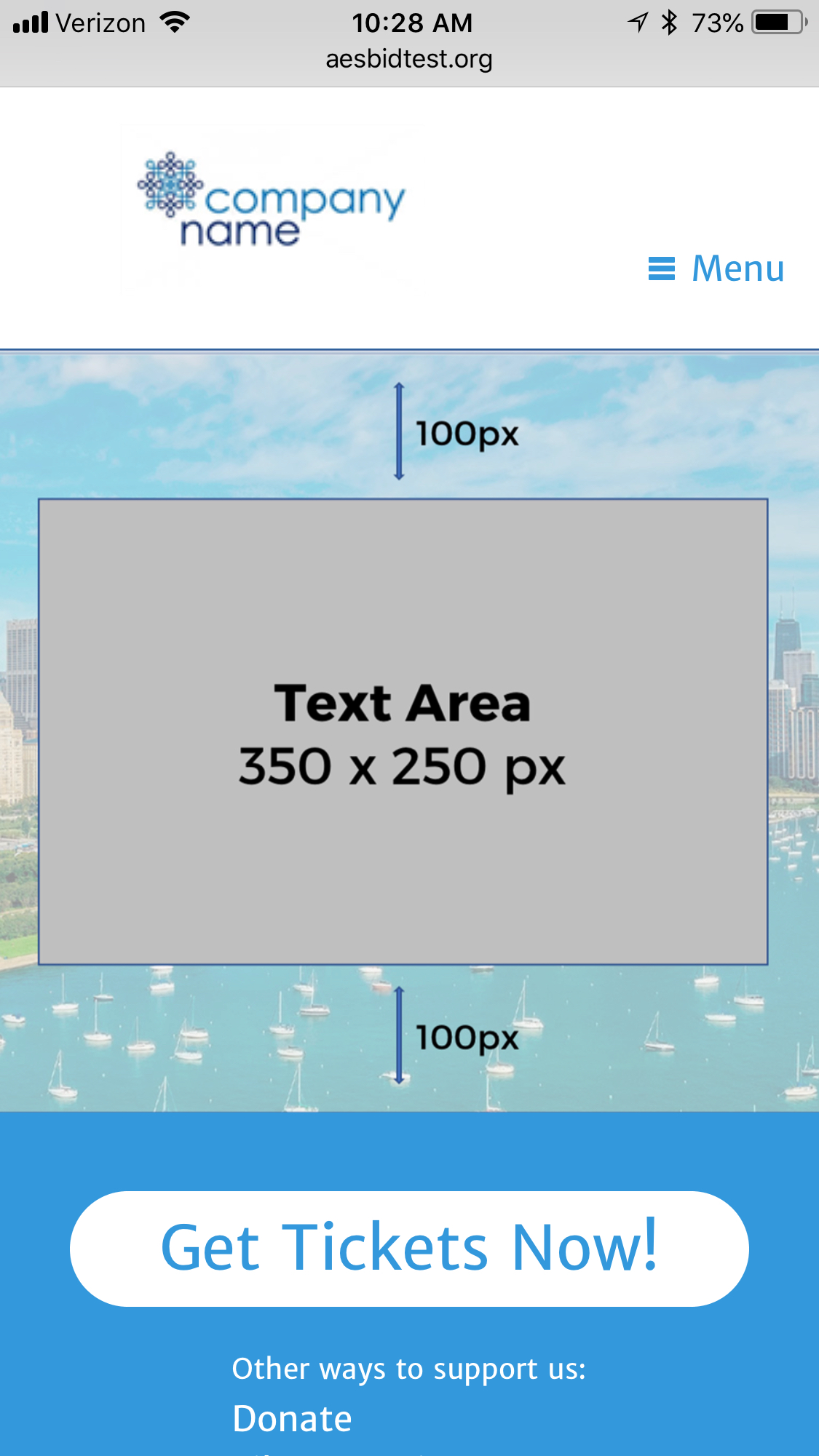
Example - iPhone 8 Plus
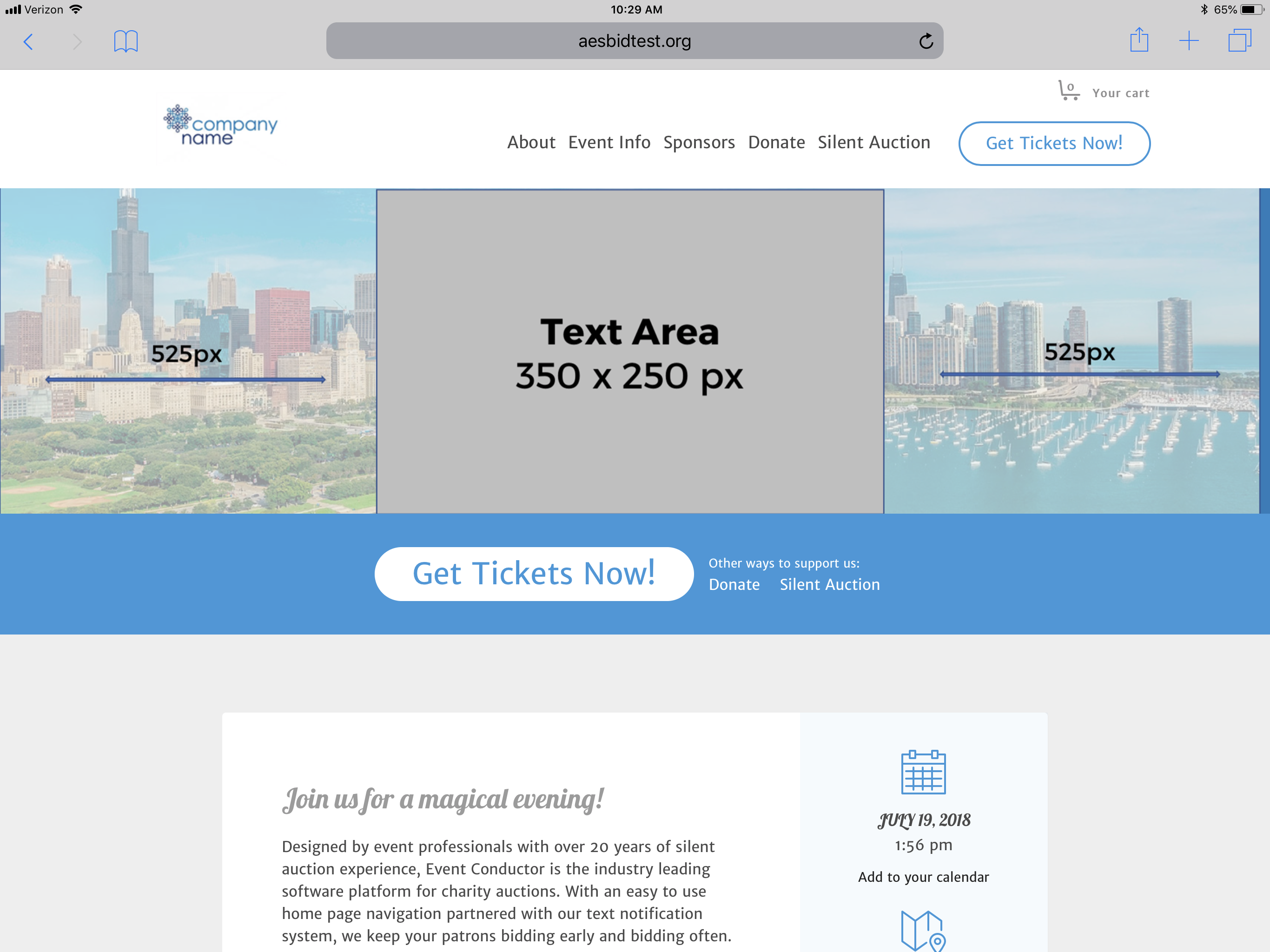
Example - iPad (Landscape)
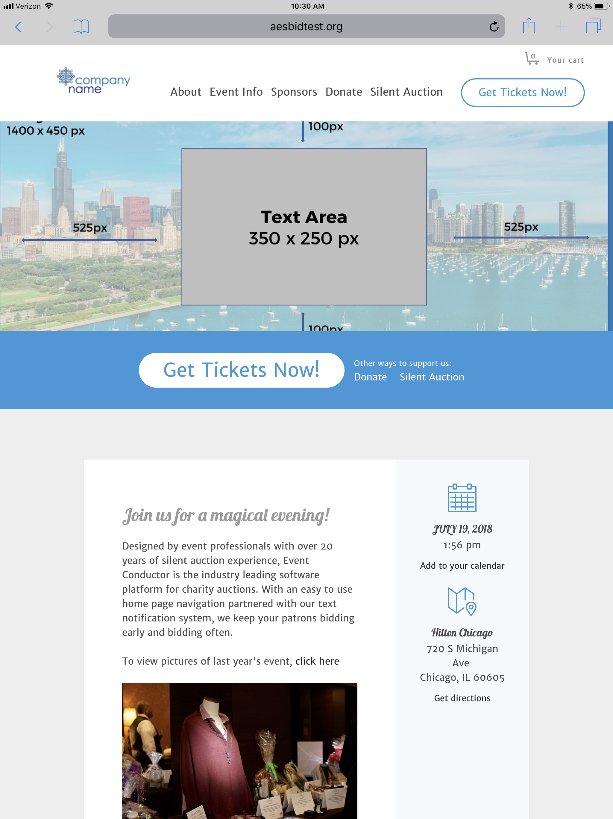
Example - iPad (Portrait)
How did we do?
Guest Invites (RSVP's)
Microsite Banner Notification Feature